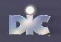
In one of my parents' photo albums, there is a small laminated picture of me sitting on the lap of a Mall Santa Claus. As a small fry, I could look at the photo side, but I could never look at the opposite....because the mall had plastered its logo there.
GAAAAHHH!! THAT "C" LOOKS LIKE IT COULD EAT ME!
Clackamas Town Center got rid of this logo before I became a regular customer. Good thing....it's not only butt-ugly, but traumatizing for children. That's obviously not the reaction the mall owners had in mind.
Some frights are universal and understandable--most people would find being stuck in a small dark hole filled with spiders terrifying. But fear is a stronger, more complicated emotion than that....especially when you're a kid. Some things can trigger fear for no visible reason.
TV production logos are exhibit A, although there are factors to consider: they have no human features and no soul. They appear out of nowhere and vanish as quickly as they left. And often, they make bizarre, unearthly noises. Today I've compiled the most popular "it scared me as a child" corporate logos, as chosen by majority. I don't understand how some of these are supposed to be scary, but I'll take their word for it....after all, I never saw them as a kid.
ENTRANT #1: VIACOM "V OF DOOM"
ENTRANT #2: SCREEN GEMS "S FROM HELL"
People who were frightened of it say one can't understand exactly how by just seeing a picture; the creepiness was brought about through a combination of the animation and music, not the logo itself. Sony revived the Screen Gems logo recently and they've been attaching it to movies....ironically enough, it's usually seen in the front of horror flicks.
ENTRANT #3: "DEEK!"
 |
So some kid is in bed, and the room looks innocent enough....until the camera zooms through the window and the letters "DIC" greet him from space. Not only that, they talk. Or the boy talks. It's not clear who's doing the talking, but they DO make clear the correct way to pronounce their corporation name. "DEEK!" |
In the 80's DIC wasn't using a talking version
of their logo yet, and every time I saw it at the end of
Inspector Gadget or Heathcliff I thought, "wow, they named
themselves a bad word!" People who are scared by this logo
say it's the talking that pushes it over the top, but it was kind
of necessary to avoid questions.
The kid in bed has been used for over 15 years, but he may now
finally be facing retirement. DIC is now using a
"globe" logo with the words "The Incredible World
of DIC!" on it....but you still hear "DEEK."
It wasn't intended to be naughty. DIC is an acronym, standing for "Diffusion, Information, Communication." Of course, DIC is an animation company from France. In France words are pronounced differently. The name could still be a swear. "He eez, how you zay, a DEEK!" Think about it.
ENTRANT #4: THE WGBH "FLASH OF DOOM"
Now this one, I can really understand. Most people hate this logo, and the hatred is cross-generational. WGBH Boston is one of the flagship PBS affiliates and produces a lot of the original programming PBS airs nationwide. Not only is its logo sequence certifiably creepy and unnerving, they have never replaced it since its original appearance in 1978! No matter who you are--young or old, 7 or 77--you've had to suffer through this logo at least once. It needs no introduction to American readers.
But for foreigners, here's the deal: glows of light slowly etch out "WGBH," which glows brighter and brighter until the glow fills the screen. When it dies down enough to see again, "Boston" and then "Presents" are shown. This is accompanied by one of the most ghastly sounds ever synthesized, and a few trumpets.
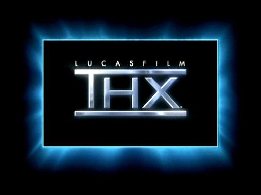
Our final entrant is the Big One; the One Scary Logo To Rule Them All. Unlike these others, this one was no accident--it was intended to have that sort of effect on people. Come on up and accept your reward:

Was there ever any doubt?
Tomlinson Holman's eXperiment has been the sound system seal of approval for over 20 years, making theatergoers squirm the moment the groaning rumble begins since 1983. "THX" has my vote for "most ominous logo of all time," and it certainly tries. Of course, the noise is what clinches it.
The noise has a name; it's called "Deep Note" and it was programmed into existence by musician and computer technician James Moorer in 1982. Moorer never put the story behind the noise to words until the blog "Music Thing" asked him to. You can read all the details there, but just in case the blog disappears......
"I've never written the THX story down (nobody ever
asked). So, here's the whole story:
"I was working in what was then called the "Lucasfilm
Computer Division" that existed from roughly 1980 to 1987 or
so. It spawned several companies, including Pixar and Sonic
Solutions. I was head of the audio group. In about 1982, we built
a large-scale audio processor. This was in the days before DSP
chips, so it was quite a massive thing. We called it the ASP
(Audio Signal Processor).
"At the same time Tom Holman was also working at Lucasfilm.
He had developed what is now called the THX sound system. It was
to premiere with Lucasfilm's "Return of the Jedi." They
were making a logo to go before the film. I was asked by the
producer of the logo piece to do the sound. He said he wanted "something
that comes out of nowhere and gets really, really big!"
I allowed as to how I figured I could do something like that.
((((insert really boring technical details here...)))
"When we went to sync up the sound with the video (which
I hadn't seen yet), we discovered that the timings were all
different. I readjusted the times, generated a new score, and in
ten minutes, we had the sound synced up with the video perfectly.
There are many, many random numbers involved in the score for the
piece. Every time I ran the C-program, it produced a new
"performance" of the piece. The one we chose had that
conspicuous descending tone that everybody liked. It just
happened to end up real loud in that version.
"Some months after the piece was released (along with
"Return of the Jedi") they lost the original recording.
I recreated the piece for them, but they kept complaining that it
didn't sound the same. Since my random-number generators were
keyed on the time and date, I couldn't reproduce the score of the
performance that they liked. I finally found the original version
and everybody was happy.
"If you get permission from THX, I can supply you with the
written "score" for the piece (in music notation - this
was used to get the copyright) or even the original C program
that produced the parameter lists. I can't supply you with a
program that makes the sound itself.
"The ASP was decommissioned in 1986 and later sold for
scrap."
Here are the THX trailers the official company website offers. There have been many many more:
Wings: The first THX promo, and only
seen before Return of the Jedi in theaters that got THX's
approval. It must have been eerie to hear that rumble for the
first time and have no idea why. It's called "Wings"
for no reason at all.
The Simpsons one: THX turned the Simpsons THX scene into a
real promo. They used the same animation piece, only it was
cleaned up and widened (no letterboxing; they expanded the area).
According to the commentary for "Burns' Heir," it ran
for about three years.
Cimmarron: It's from 1988 and it appears to be the version
that Tiny Toons parodied (conductor's baton, explosion....) The
only difference is that the noise ISN'T IN IT. I didn't know
there were some promos with no "Deep Note" until I
found THX's trailer gallery.
UPDATE: It looks like Cimmarron has been removed from the THX website
and replaced with Cavalcade. However, it's still on their server. You
just need a link to it...
There you go.
Tex: Tex is the robot you sometimes see in THX promos. He
was created by none other than Pixar legend John Lasseter and he
basically messes with the logo. Most famously, he plugged a moo
can into it and made "Deep Note" into "Deep
Moo," until the logo started a stampede.
People: The conductor's baton is seen again, and this time
numerous pictures of people blast at you all around (maybe they
were stills from movies--I dunno, it's been a while since I've
seen this one). The THX logo comes toward you at the end, at a
downward angle.
Cavalcade: By far the coolest THX of them all, this starts
out as a ball floating in a strange blue area with thunderous
clouds all around. Lightning strikes and the ball is shattered
into thousands of pieces (and you hear them fall all around you),
then the pieces liquify and rise T-1000 style into the THX logo.
The second half of the noise plays and lasers slice a border
around THX. This version is now being added to DVDs, but
experiencing it in a theater was a lot better. This's my
favorite.
Bounty (the 20th anniversary edition): Various events in
movie history are seen through the foggy reflection of the THX
logo--you see lightsabers and lightning flashes while hearing
sound effects and movie quotes like "9.2 GIGAWATTS!!!"
A message appears at the end thanking movie patrons for 20 years
of THX, and one more quote--"SMOKIN!!" is heard during
the noise.
Science of Sensation: The newest promo in the bunch, this
one just gets back to basics and blasts the noise at you--at such
a bass level that the chairs shake. Hence the sensation.
People have been sued for ripping the noise without permission, though it generally depends on how big you are and how much money you're making. Dr. Dre lost a settlement when he used Deep Note in an album in 2000, but I saw a local anime shop use it in an ad with no consequences. You can go ahead and annoy your sister with it; just don't tell Lucas.
Have a good night, everybody. And don't worry....there's no WGBH logo waiting under your bed to strangle you. Or......IS there?
TO RETURN TO THE MAIN PAGE, CLICK HERE
TO HEAR THE "SONGS TO WEAR PANTS TO" GUY IMITATE THE THX NOISE WITH ONLY HIS VOICE, CLICK HERE